Showing posts with label Editing. Show all posts

Saturday, 12 November 2011

ANCILLARY TASK 2 - CREATING MY MAGAZINE ADVERTISEMENT

At first, I thought about using the programme Microsoft publisher because I was familiar with it and knew that it was ideal for creating things such as advertisements. Though, when I began this, I switched to photoshop because I was more comfortable with using this programme because after working on the programme for my CD cover, I felt more confident using it.

Again, I began by editing the image I had chosen to use for my advertisement. Instead of using picnik, I edited the image on photoshop, because it was only a slight change.
I chose this image because it links directly to my front cover of my CD in ancillary task 1. This is a convention seen in real media products when advertising something, especially CD albums/new released music.

After this, I decided to play about with the layout of my advertisement, referring to my original plan throughout, though I did change some of the ideas whilst creating my advertisement. This was due to reasons such as the text couldn't be seen in specific areas and general dislike for certain things.

First I included the text stating the name of the artist. I decided to keep the colour of the text white and red. This links directly to my CD cover, which is also white and red. This is also why I used pristina font, to keep continuity.
By looking at other magazine advertisements, I decided on how to layout my own advertisement and what text to include. From the Youmeatsix advert, I decided to use 'OUT NOW' at the bottom of my page.

I also decided to create a music critic company and a statement about my advertisement to place alongside a star rating. This is to promote the album further by encouraging people to but it. By quoting a reliable source involved in the music industry, it allows the source to be more reliable.


I decided that I would need to create stars to be able to rate the album, which can be used with my critic opinion. Originally, I decided to use the programme paint to create the stars to copy over. Whilst trying to do this, I found it hard to delete the background of the stars, so instead used photo shop to create the stars.
An issue with this, was the size because it was difficult to create the same sized stars each time.


Tuesday, 1 November 2011

ANCILLARY TASK 1 - CHANGE TO FINAL PRODUCT

After receiving feedback, I decided to change the images used on the front and inside cover of my CD product, this is now my finished product;


As I decided to change the front cover image to the one used originally for the inside, I had to think about the layout and how I would change this. I decided to keep the text and colour the same for continuity but I had to rearrange where to place this on the page. I decided to still overlap the text with the subject because this is representative of many CD covers.

This is how I edited the inside of my cover when changing the image. From looking at both my original front cover and original inside cover, I decided that I wanted to try and incorporate some of the layout I used, including the writing along the bench.
I have set out the question and text similarly to my original but on the opposite side. The subject of the cover is connoting loneliness and shows that the artist is searching for something she no longer has.
I have kept the continuity by using the same font and colours, but I have incorporated yellow font into this cover. This is because I wanted to have something stand out on the page, which will attract the viewers attention. As well as this, yellow will appeal to my target audience.
Overall, I am happy with my changes to the inside and the front cover of my CD case.

ANCILLARY TASK 1- THE RIGHT SIDE OF MY CD COVER

After thinking I had finished the inside of my CD cover, I realised that I needed an image or background for the right hand side of the case, to be seen behind the CD itself.
When thinking about this, I had to decide whether to use an image of the artist, an image linking to the artist or a blank background colour.When thinking about this, I needed to think about how it would link to the
album and what it would be able to represent.

After thinking about my CD product as a whole, I decided that the best option would be to have a blank colour background or an image that does not include something bold. I decided this, because I felt that the Cd product was complete with many images of the artist herself which were bold and appealing to the audience. For the right side of the cover to be an image as well, I believe that this could make the product slightly overpowering.

In spite of this, I still need to be representative of the album and the music video, so  I decided to use the image of the grass that I was originally going to use for the left side of the inside of my cover.


This edited image of the grass is suitable for the right cover of the CD case because it is representative of the album and represents continuity whilst still being somewhat subtle and simple for the audience to see.

ANCILLARY TASK 1 - CREATING THE INSIDE OF MY CD

I decided to again change my idea. This is because I wasn't pleased with how my first attempt planned out, including the background picture I used. Instead of the grass,  I decided to experiment with a previous image I had taken of my artist and didn't use on the front cover of my CD cover.

In keeping with the content I wanted to include, I still decided to advertise a competition with a question to answer.
This is what I came up with:


As you can see from this, I am keeping up with the style of the CD cover, showing continuity throughout the Cd case.

ANCILLARY TASK 1 - CREATING THE INSIDE OF MY CD CASE

To keep with continuity and now that I was familiar with the website, I decided to again use photoshop to make the inside of my CD case.

Step 1 - For the inside of my CD cover, I decided to use grass as the background of my page. This is to keep in continuity with the rest of the CD cover, as well as the genre and my music video. After taking images of grass, I decided to edit the image. This was to make the image more vibrant and appealing to the audience.
Step 2 - As well as this, I wanted to use an image of my artist on the inside cover of the CD. This is to represent and promote the artist.


After playing around with photo shop, this was my first attempt. Though I like the image cut out and the layout that is forming from this, i don't like the image itself. This is because the side of the guitar is cut off.


ANCILLARY TASK 1- CREATING MY BACK COVER

Like the front cover of my CD, I decided to use photoshop to edit the back cover of my CD.
As I had yet to decide exactly how I wanted my design to be, I had to work around photoshop, to decide exactly what I wanted to do.

Before using the image of the guitar, I decided to edit it on photoshop to make the image lighter.


I didn't change many settings of the photo, but I decided to make it lighter by changing the exposure.
 

Step 1 - I inserted my Image into photoshop                 Step 2 - Once inserting the background, I had
and made the size of the image smaller.                          to insert text. I decided to use white to
                                                                                     contrast the green background. I chose Pristina font
                                                                                    because this seems carefree whilst elegant.


I added text to the right of the image. I used the colour white so that it was clear to read. This will be used to write my track list. I also used the text Pristina because it is connotes something carefree. This also links to the theme of country and seasons.


Step 3 - After knowing what text to use, I had to                          Step 4 - As well as including the track create names of the tracks in my album. To go about this,             list,I started to think about the other
I thought about my title 'Back to December' and how it                piece of information I would need to In
represents the past and a love story. As well as this, I                   include. In keeping with the continuity, I thought about how it links to months and seasons. With                again used the same font and colour to these themes in mind, I decided to create songs that link               promote the artist and record label and to this e.g. Snow Blind. As well as this, I wanted to represent          the bottom of the cover. To do this, I  a story within the tracks. By the end of the track list, the                stated the record company name and a
track 'Summer Moved on' can connote the realisation                 website for the artist.
and forgetting the past (moving on). 

                                                                     
Step 5 - I also needed to find a bar code to use on the back cover of the Cd. This is essential in terms of purchasing the products in stores and marketing use. I found a bar code to use from the Internet and located it in the corner of my cover.


This was my original final CD cover.
Once asking for feedback from fellow peers on the back cover of my CD, the main feedback was concerning the text on the bottom right of the cover. This was said to be to light in regards to the background and unclear for the audience to read.


To overcome this problem, I made some slight changes to the cover. This is my final design.


Sunday, 16 October 2011

ANCILLARY TASK 1 - CREATING THE SPINE OF MY CD

Before starting to create the spine of my CD case, I had to find out the measurements.
I found out that the size of the spines were:
Size: 118mm x 6.5mm
With this in mind, I was now able to create a spine using photo shop.

I started creating my Spine on Photoshop by importing the right size document.


I decided to include the album title, 'Back to December' because this is most common on music album spines. To keep the continuity, I decided to use the same font I have used previous and the same colour of Red, written on a white background.

I then decided that I wanted to name my record label, which is often seen on spines, for promotional purposes.
Though I originally wanted to name the record label company, after completing the text I wanted, I felt as though there was not enough room along the spine. In regards to this, I decided to create a logo to represent the company, which is also often used instead
To do this, I used paint to create a simple lightning bolt logo.


After creating this, I simply made the logo smaller and located it at the bottom of my spine.


Wednesday, 12 October 2011

ANCILLARY TASK 1 - CREATING MY CD COVER

Now that I have decided on the images that I would like to use and are aware of the conventions that are needed on a CD cover, I am now ready to start making the cover of my CD.

Before making my CD cover, It was important for me to know of the size and specifications for a CD cover so that I can produce a cover that will suit a CD case. I found out that a standard CD cover case is 12cm X 12cm for the front cover and 11.75cm X 15.1cm for the back cover, Including the spines.
These sizes are shown below:
standard CD jewel case cover size illustration


I decided to start creating my final front cover on photoshop. I chose this programme because it enables me to edit images the way I prefer and to create a CD cover in an easier and more practical way.

This was an original idea for my front cover, after playing around with Photoshop. Once finishing this first design, I decided that I didnt like this because the image looks squashed together. As well as this, I thought about the image itself and decided that with the mouth of the artist open, it may not be appropriate for an album cover.
I like the font of the text used because it represents a carefree spirit but it is hard to read this text.

After using this image and not liking it, I decided to change the image.


Step 1 - Before using my image, I had to use picnik to edit the image. This is to make it look lighter and stand out to the audience, especially as this would be the first thing the artist would see in a store.


Step 2 - Again using photoshop to edit and create my front cover, I inserted my image and added some text. As I had already tested the writing, I knew that I wanted to use Pristina but I didnt know what colours to use and how to layout the writing on the page. With this in mind, I had to experiment with both.

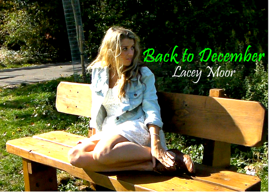
I used the colours white and green and located the text straight and to the right of the subject.  I chose this side because it is darker and so would be easier to see.


I then changed the colour and the layout of the text. This was to experiement with both. I preferred the name of the artist on the bench. I think this was good because it is using an area of the image for a different purpose.  As well as this, I like the use of white because it is in contrast to the background colour. Im am still unsure about the layout of the 'Back to December' text.


I then decided to move the song title text to the same area of the artist text as well as change the colour. As the title overlaps with the main subject of the image, It was difficult to find aa colour that was bold enough to be seen, especially the yellow and green used before, which is why I changed it to red.


ANCILLARY TASK 1- EDITED PHOTOS


These are my two possible images for my front cover after I edited them both slightly. I decided that it would be good to make the photos lighter and more dynamic.

After doing this, I was able to make a decidion as to which image to use. I decided that I would use the image at the bottom. Even though I originally preferred the image above, after editing both, I felt that the colours of the other image was more attractive and would appeal to the audience. The top image colours in the background especially are 'messy' because the fence is badly painted. As well as this, I think the location in the tree is more vibrant and  different.
I have decided that it is also important to keep the cover coloured instead of black and white. This will attract to my specific target audience.
In spite of not using the top image as the front cover, I may beable to find somewhere else to use it.

ANCILLARY TASK 1- EDITING PHOTOS FOR MY FRONT COVER


I decided that before choosing an image to use for my front cover, that I would edit both images slightly to make the quality and colour different. By doing this, I will be able to look at both images and make a decision through this. As I only wanted to edit the photos slightly, I used windows photo gallery. This allowed me just to adjust the colour of the photos and the brightness of the image.

Tuesday, 11 October 2011

UPLOADING MY VIDEO TO YOUTUBE

To publish my music video, I decided to upload it to youtube. By uploading my music video to youtube, it allows me and other peers to view my video in an accessible way, whislt being able to give me feedback.


As I did not want my video to be public and could not make it private, I decided to set it as unlisted, so that people who have the link to my video can watch it but others cannot. I did this, so that I am aware of who is watching my music video whilst still being able to be accessed by various people.


PROBLEM REGARDING MY MUSIC VIDEO

After receiving feedback from both my teachers, it was suggested that I change the length of my music video because it is too long.
As my shots are too long, I have decided to cut the end of the song to make it shorter. I will then be able to use these shots from the end to mix up the beginning of my video by including more 'past' shots of both my actors.
This will be useful because I will be able to add more variety to the beginning of my video, as well as it being a more manageable size that I am happy with.


I had to split the music at a certain point in the song to make the song shorter.

THIRD ATTEMPT OF MY VIDEO


I tried to change some areas of the video that I was unhappy with. This was my final original music video.

SECOND VIDEO ATTEMPT


After knowing what I had to edit from my first attempt, this was my result. From the first attempt, I have changed the lip sync in various places and added in footage in the places that were empty.
I still need to change the lip sync at the very beginning of the video for me to be fully happy with it. I am aware of certain areas in which the camera is shaky, so I need to try and work my way around this.


FIRST VIDEO ATTEMPT


This is my first attempt at my music video. After working on the programme, I decided that it would be a good idea to start editing my footage so that I could then work on it from there.
I am pleased with what I have produced, but there are still problems that I need to overcome.  In areas throughout the video, I am unhappy with the lip sync and currently there is a large section that has yet to be filmed or edited which I have not put in yet but overall I feel that this has been successful.

USING THE GREYSCALE EFFECT

When editing my Music video I decided to use the greyscale effect. This was to be used on the shots that are referring back to the past.
Luckily enough, this was an easy option which I could edit through the programme I used.
By changing the colour of the shots, the video becomes more varied as well as becoming effective for the audience. The difference in effects represents the clear idea between past and present, whilst greyscale effect is commonly used in music videos because it is a common and recognisable effect.


This is how I would include the effect into my Music Video.


EDITING MY MUSIC VIDEO

To edit my video, I decided to use Windows movie maker for various reasons. I believe that Movie Maker is good enough to edit my video.

Windows Movie maker allows me to insert music and videos in a simple way. There is also ways to change the speed, the times, the transitions and the colours of the movie. I believe that this is all I need to be able to edit my movie the way I would like to. As well as this, I am familiar with the programme, so I feel comfortable with using it.